The Kitchen Plan
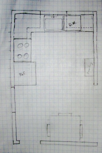
I’m nowhere near done taking stuff out of the kitchen — there’s a pile of cabinets still, tiles still, walls full of glue, etc. Anyway. Once all that’s done, though, this is sort of the plan. Comments welcome.
So yeah — it’s not a real detailed plan.
Each square is six inches, the room is 9′ x 14′. The thing marked on the wall on the left side is a glass brick window that starts three feet off the floor and is four feet tall. There’s a normal window above where the sink is. The stove is where the 220-volt outlet is. The sink is the only place that’s currently plumbed (it’s not plumbed for a dishwasher or an ice-making fridge). The little foot-deep box on the right would be a pantry. Currently, the main entry (on the right) is only three feet wide (starts at the bottom of the page). The entry at the southwest corner of the image goes to the basement stairs and door out to the side yard.
It’s kind of an awkward space to design around given that I don’t want to move the plumbing around (this house is sort of a flip, after all). The 1958 kitchen was U-shape sort of. The counters extended another foot from the top along each side. The fridge was on the east side of the page, the stove on the west side. I don’t like the implications of that design for counter space, PLUS, it made it impossible to fit a dishwasher in next to the sink (or anywhere else for that matter without adding another 24 inches of counter-top, which wouldn’t be a horrible idea except that thrift is a virtue here).
The thing at the bottom of the page is a kitchen table — I’m not sure how you could ever get more than three people to sit down at a table in this house no matter what you do. I mean, short of blocking doors or whatever.
I also thought about doing it galley-style where the fridge is at top-right, the dishwasher is left of the sink, and then there’s three and a half feet blank south of that before there’s another run of low cabinets going across, where you’d find the stove. But there was some reason I didn’t like that. Maybe it was because of the fridge being trapped in the corner.
And, yeah, that’s a 25-inch single-tub sink. To preserve more counter space, I figure.
My real estate agent came by on Friday to tell me what to do design-wise. He’s pretty competent, but here’s what he said on the kitchen:
- Slate tile floor.
- Run those tiles all the way up to the ceiling on the back wall (!).
- Bottom cabinets should be dark wood to match the stain of the hardwood in the living room and hallway.
- Top cabinets should be “stainless” and should incorporate at least a couple horizontal pieces with frosted glass.
- Granite tile counters (dark/black).
- Stainless appliances and they don’t have to be the same brand.
- Make sure the sink is deep.
- Don’t need to plumb for an ice-maker.
- Leave the lights (don’t put cans in).
Yep!
So I guess I’ve put off carrying garbage out of the kitchen long enough for today and, therefore, I say “adios” — or at least type it.
bkd


Is your agent a man or a woman?
A dude. (What were you guessing?)
Totally dude. It doesn’t matter that the appliances aren’t the same brand????
“An old wives’ tale” were his words. I mean, plus it’s Pittsburgh. If I painted the exterior brick black and yellow, that’d probably help re-sale. Not that there’s anything wrong with that.