The Color Wheel of Misfortune
More like “bad decisions” than “misfortune”. Or maybe more like “difficult, non-binding decisions that could not be made without investment of time and money”. Something like that. It’s taken too long to paint the three rooms I’m painting and part of the deal has been color decisions.
Before I moved out here, I was thinking I’d go with “colonial” colors, shades that I thought George Eastman could live with. To that end, I found a set of “Colonial Williamsburg” colors here, that I thought would cover it. Once I got out here, though, I looked through my photo catalog and saw the color I had in my NYC apartment and thought that, man, yeah, I dug that color, I should just do that. So I went Behr’s website to try and find it, but couldn’t. So then I got kind of mad at myself for waffling and thought, y’know, screw it, I’m just gonna be decisive, so I went down to Lowe’s and came up with a shade of green that looked good on the card and had them mix up a gallon of that green as well as the lighter version of it, since it’s a small house and I didn’t want to go too dark. Got home, broke open the lighter green (it was called “Milkweed”) and painted The Good Bedroom:
A lot of milk, not much weed. Seemed darker on the card. Waited overnight to pass judgment on it, since, sure, it could dry darker. In the morning, went in and, after spraining a cornea trying to differentiate the Milkweed walls from the Ultrapure White ceiling, decided that the walls mostly looked like I’d tried to paint white on top of blue-green and done a really shoddy job of it. At which point I gave up on the Lowe’s colors. Lowes. Whatever.
That decided, I went back to thinking I could re-do the New York apartment. When I’d been unable to find the NYC green on the Behr site (it was called “Lilypad”, may it rest in peace), I’d gone to the Home Depot site and ordered up samples of a bunch of greens that might fit the bill. Those had arrived, and so I painted sample splotches on the kitchen wall that’s gonna get demoed. The colors ranged from circus-like to insulting. Except for one. It was called “Fairway Mist”. Waited overnight for the splotches to dry (yeah, photo would have helped the story, fat lot of good it does for you to say so now), then discovered that Fairway Mist was close, but probably a little too bright. So that evening I went to Home Depot and bought three more buckets: a slightly toned-down version of Fairway Mist (“Peridot”), that color’s lighter cousin (“Spring Morn”), and a color I’d had on the wall in NYC that offers pretty good contrast for images projected on it via my LCD projector (“Silver Screen”).
That night I dreamed that I was on Survivor and was the first person voted out of the game. That ego-crushing nightmare brought me to the realization that George Eastman would laugh me out of Rochester if I showed him the colors I was going to use (if only he weren’t dead), which caused me to revert back to Plan A. Drove out to the Special Person store in Castle Shannon (it’s a suburb), which carries the kind of paint that comes in “Colonial Williamsburg” colors. The store is a “Special Person store” in the sense that I think you gotta be pretty special to afford the stuff they have there. $15/sf for slate tile? I’m not that special.
Unfortunately, I hadn’t brought the PDF of the brochure (it had been black-and-white anyway), but the helpful helper person at the store went online and printed it off. In real life the colors that looked pretty good on screen looked like crazy Home Depot samples on the color chits. Therefore I enlisted the help of the store person (must be hard to be a woman and have everyone assume you know how to match colors all the time). Through serious and sometimes contentious negotiation with her, however, a coherent color palette emerged, consisting of medium (muted) green, lighter (muted) green, medium (muted) blue, and a pleasant bisque color for the narrow hallway. After waiting two hours for them to mix the colors (?!), I rushed home in a developing rainstorm to finally, finally get some real painting done. Got home, opened up the bisque, and started painting.
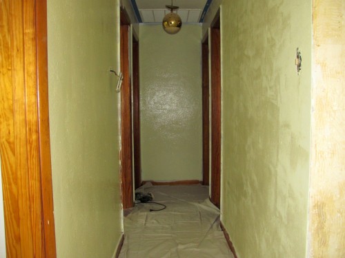
 Eastman would probably refuse to let me even buy film from him if he ever saw *this*.
I suppose it should have been a red flag that the color was called “Palace Chambers Yellow Light” — but it didn’t look that yellow on the card. I mean, yellow-*ish*, sure, but it had looked more like the color of a sunlit rope, not, you know, this. Man. Anyway. Even before it dried I was pretty sure I was going to be re-painting the hallway also.
That’s about it for the misfortune. I was kind of hoping I’d have built some tension into the story by this point. I should have established some stakes earlier on so that you’d be desperate to read the outcome. OTOH, that’s a little cliche. Tension? Yeah, it’s been done. I don’t need to roll that way.
bkd


For some reason, I have always had better luck with the paint colors at Menards. Impressed that you “do” color. Mr. Telk sees no reason why every room in the house shouldn’t be white.
Mrs. Telk
@Mrs. T: We don’t have Menards here (although for some reason I know their jingle), just the Despot, Lowes, and a few *special* shops. I kind of like the challenge of color — it’s like a puzzle. Plus all white walls make me think I’m in a hospital or sanitarium or worse.
@DC: At some point “Restful” was in the mix. I think I probably still have that chit floating around on my work table somewhere. (1916? You’re crazy :).)
@Anyone who cares: In real-time, the painting is basically done (for now). I’ll get to posting it some day.
bkd, i just painted a green on one wall of a bedroom of my 1916-build home…check out behr color “restful” #400F-4. colonial…maybe not so much? but definitely restful for a bedroom.
i have a red in my home too, behr color “red red wine” #S-H-130. reds are hard – be careful and break out the kilz if you do red over another color.
love hearing of your remod fun…
Mrs. Telk ignores that my office is actually an antique eggshell, probably close to what you were looking for in your bisque — kind of a golden tan. (Yes, she will correct my incorrect color identification.)
What is wrong with sanitariums? At least the lighting works better in white.
In our house we have a ton of oak trim. We ended up using a tan color since nothing seemed to look good with oak door, window and cabinet trim. We used brown teepee from Behr and it turned out to be a good neutral for the house.